Dorst & Lesser
A visual and bold website to break through the noise of the booming social world.
A custom website with a striking balance between visual design and functionality
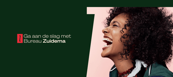
They offer training programmes for professionals who want to increase their impact and achieve their objectives while optimally using their time. With a complete rebrand implemented by our partner Selmore, Bureau Zuidema needed help translating this to the online space.
Moreover, it had been several years since any meaningful upgrades had been implemented to their website. That’s why they came to us for an updated and redesigned website to reflect their fresh branding.
Visit Project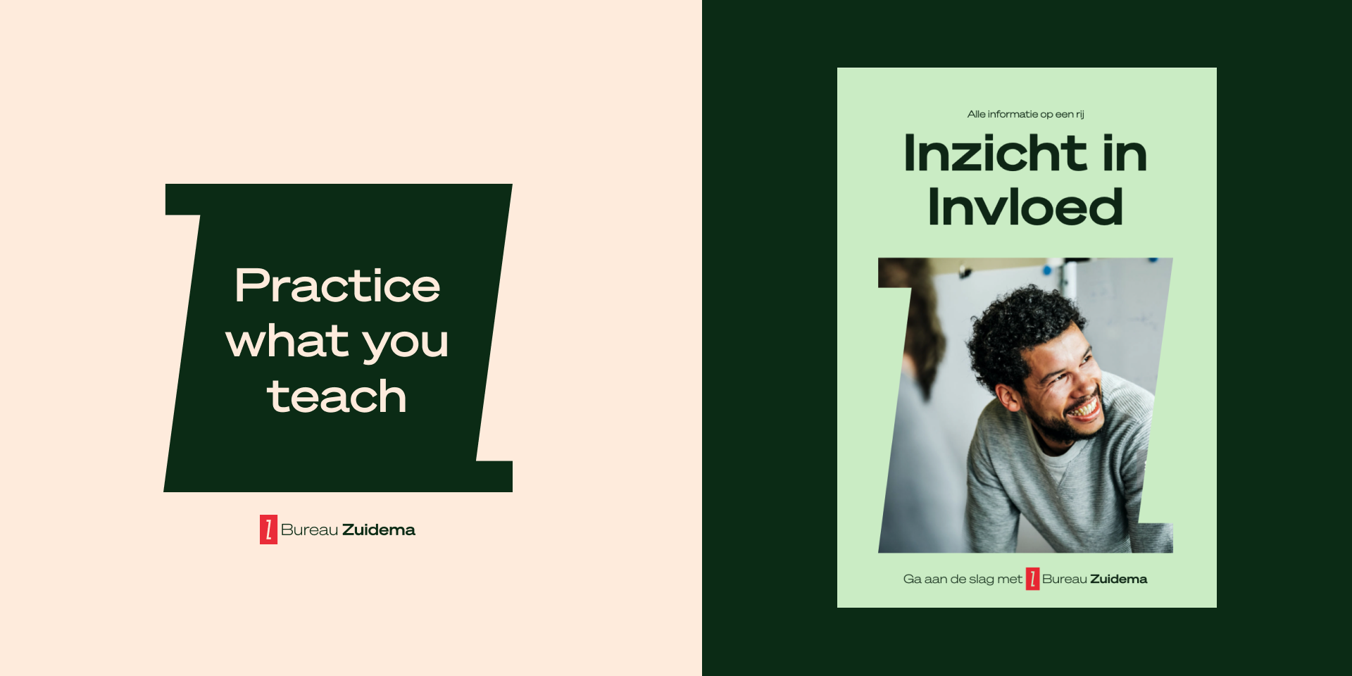
Utilizing the guiding idea "Start with Zuidema", the primary goal of the website is to illustrate how this message is utilized in a variety of ways across all three key touchpoints - the homepage, training programmes and enroll page.
We started by conducting thorough online research. We looked at different design trends and consulted with industry experts to develop a comprehensive strategy for the redesign in line with the branding. Our goal was to create an interface that is easy to use, informative and visually appealing. The challenge here was to appeal to the target audience, namely highly educated professionals between 25 and 45 years old. We opted for a clean and responsive design with visuals that perfectly reflect the brand personality of Bureau Zuidema to trigger the target audience.
get in touch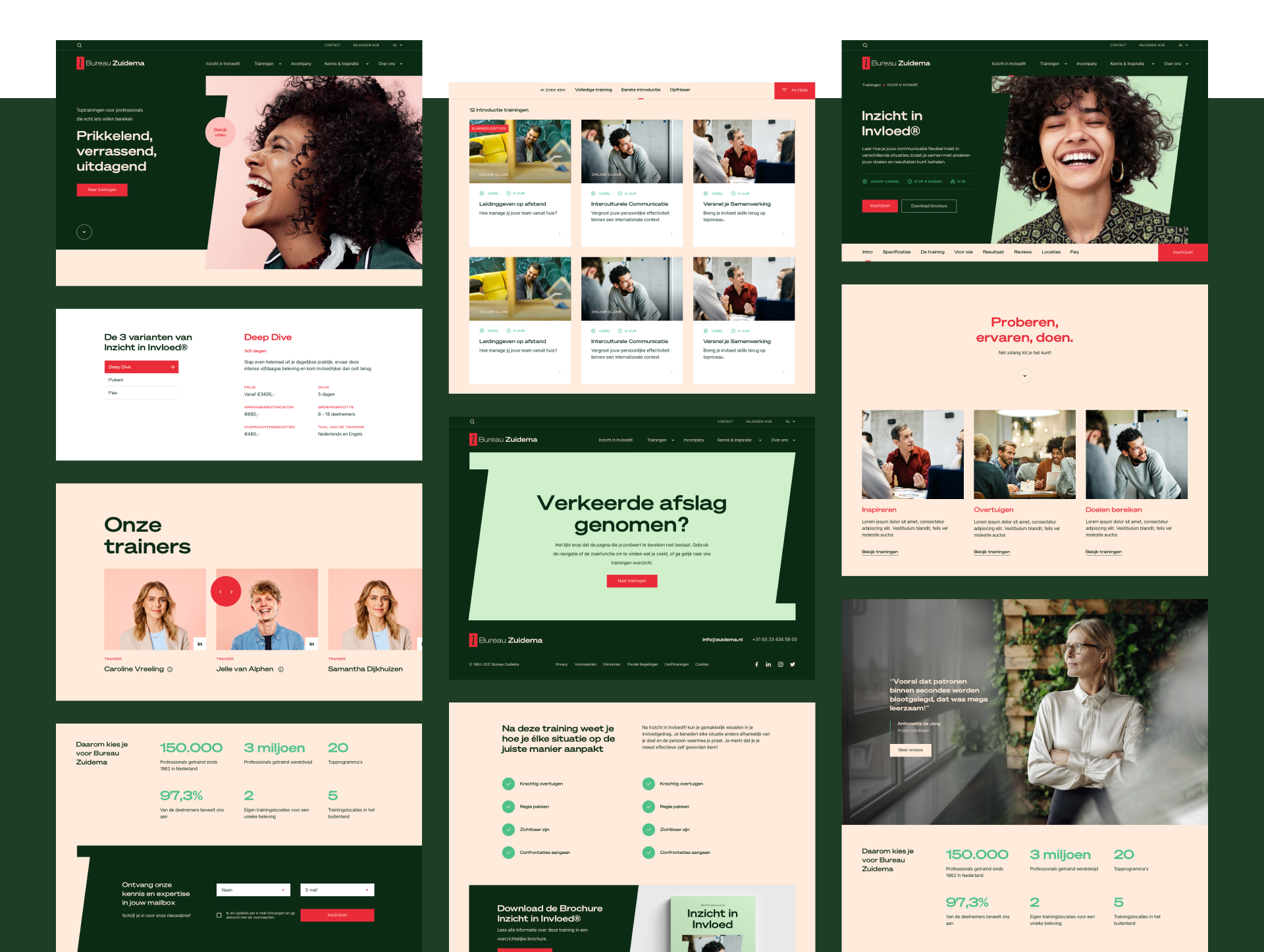
By choosing to adopt a distinctive approach in each page, we set out to provide an engaging visual experience that would remain captivating throughout the entire website. At the same time, it was crucial for us to strike a balance between consistency and variety by establishing order within our system of type styles, dynamic hero components as well as color selections across all pages. Upon arriving on the homepage, visitors immediately recognise the Bureau Zuidema Brand. Visitors are guided towards relevant content and course offerings. The course range was designed to reflect the diversity of courses offered by Zuidema. Making it easy for visitors to find the right course without any struggle and guiding them through the enrollment process with ease.
Signing up for a training course shouldn’t be daunting; it should be quick, straightforward and intuitive. That's why we strived to make enrolling as simple as possible. In three easy steps users are guided through the enrollment process. A summary is always visible on the left side of the page in order to always provide users of the selected choices. Do they have any questions? Through the chatbot functionality directly available on the page, they can always be in contact with Bureau Zuidema.
get in touch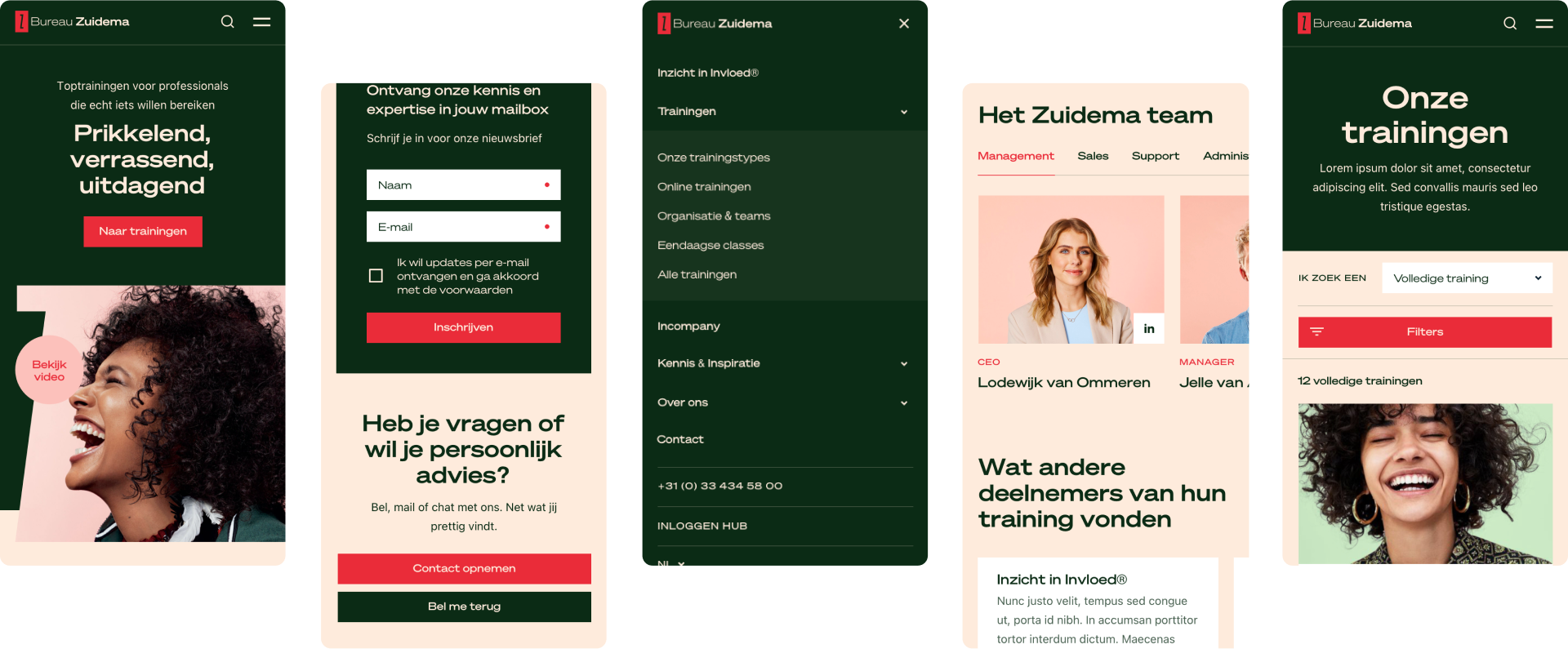
We delivered a multi-language Craft CMS website with Blitz for caching and deep integration with Exact Synergy. This allows their team to easily update the website without needing any technical knowledge. All training courses and webinars offered are synchronized from Synergy to the CMS, where marketers can effortlessly enrich them with text and interface elements.
We built a user-friendly reservation and payment flow in ReactJS, from which reservations are written back to Synergy. This ensures that all the necessary information is available, at any time. We also implemented a super fast search function, built on top of Algolia, that allows users to find training programmes and other content even faster.
get in touchThe easy site navigation leads the visitors from one section to another. The main focus of the design is providing information in an easy and fast way so that visitors can make informed choices about training programmes.
get in touch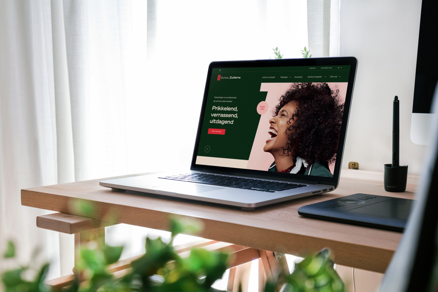
High quality design, fully aligned with their branding
To create a look and feel that is modern, professional and inviting, we used a combination of clean colors and branded photo’s. Our goal was to create a design that would reflect the high standards set by Bureau Zuidema, while at the same time being accessible.
Visually appealing user interface design
The UI design of the website is truly fitting with Bureau Zuidema’s brand story. From the colors to the fonts, everything has been carefully thought out to create a visually appealing and user-friendly experience.
Top-notch user experience design
From the moment you arrive at the homepage, you will find a clean design that is easy to navigate. We have taken great care to ensure the website is responsive and looks great on all devices and browsers. We have also incorporated features that make it easier for users to get in touch with Bureau Zuidema. All of these features have been designed with the user experience in mind, ensuring visitors have the best experience possible.
get in touch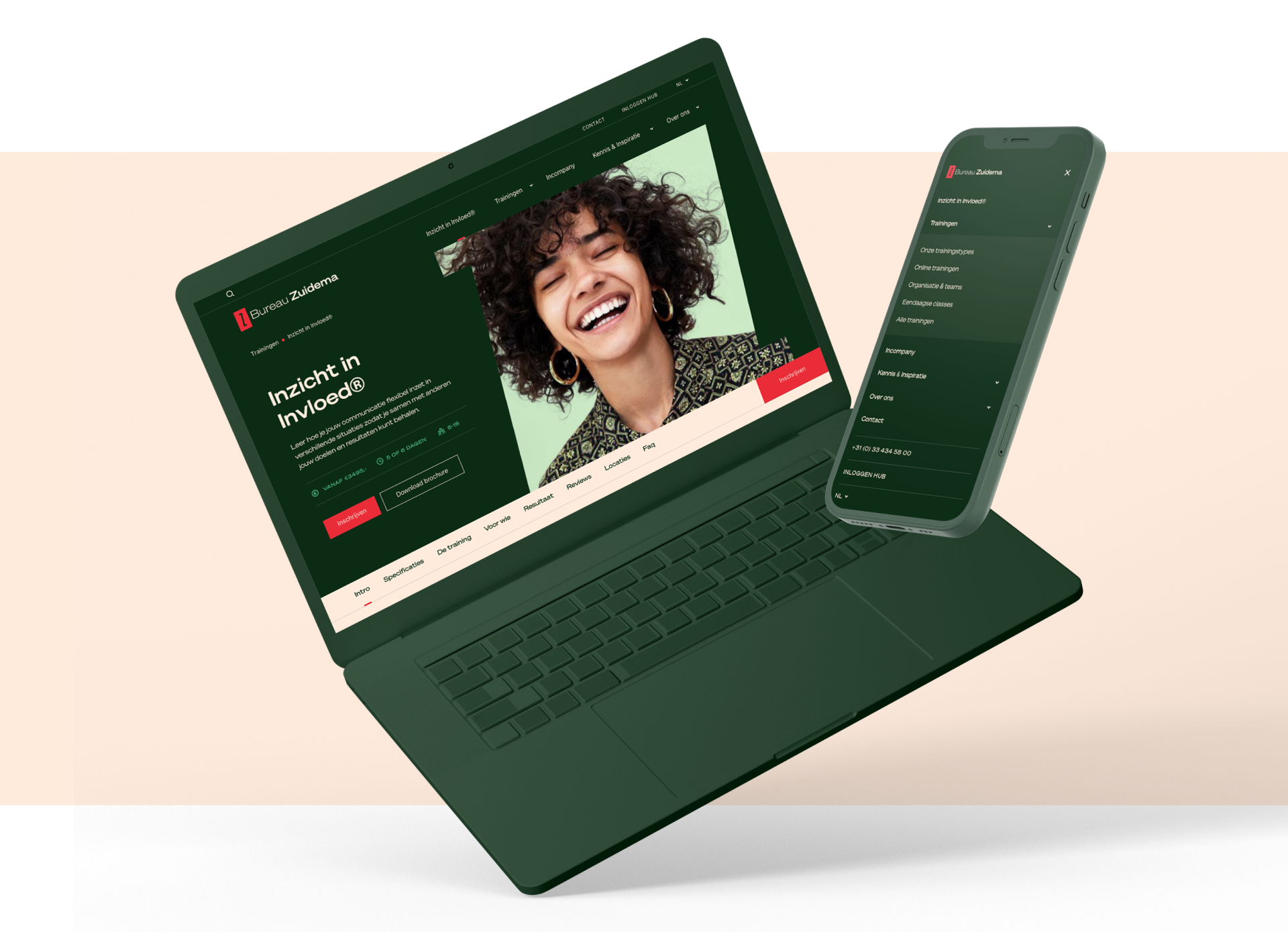
The new website for Bureau Zuidema is here to stay! Not only can visitors quickly find the content they're looking for, they also enjoy an improved overall user experience. Thanks to the improved navigation, users can easily find their way around the site, while the modern design helps ensure that visitors stay engaged. Last but not least, we helped streamline their internal processes through the implemented integrations. Increasing their impact for the years to come.
get in touchBoost engagement and bring your brand to life with a website, app or platform built to your specific needs.

.webp?width=78&height=53&name=w%20(1).webp)